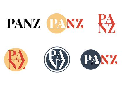
P.A.N.Z. Rebrand
Brief:
This was an internship project at the Public Eye studio based in Auckland, New Zealand. The Publisher's Association of New Zealand (PANZ) is an association that aims to guide, develop, establish and represent the publishers society within New Zealand. The brief was to create conceptual brand collateral as part of the PANZ rebrand. This included redesigning their logo, colour scheme, fonts and and website. PANZ is an association that aims to guide, develop, establish and represent the publishers society within New Zealand.
Solution:
Through gathered research on the PANZ brand as a whole, I designed a logo that reflected their main brand values - Community, NZ Culture and Heritage, and Education. The logo chosen portrays an open book emitting beams of knowledge and waves of communication. It is also an adaptation of the head of an owl a symbol of education. The beams and book's shape follow patterns from traditional Maori artwork. The display typeface, Playfair, is also implemented as it coincides with natural koru-like curls, also an element of traditional Maori design. The colour scheme is taken from traditional Kiwiana items such as the bumble bee toy and Footrot Flat books. These design treatments were all used to implement New Zealand's Culture and Heritage.
Logo Final

Logo Concepts
Playfair Bold
Heading
Playfair Regular
Display Paragraphs
Typeface
Primary
Colour Palette
Aa
AaBbCcDdEeFfGgHhIiJjKkLlMmNnOoPpQqRrSsTtUuVvWwXxYyZz

Roboto Regular
Body Text
AaBbCcDdEeFfGgHhIiJjKkLlMmNnOoPpQqRrSsTtUuVvWwXxYyZz


Secondary
Website Concepts


Website Final


